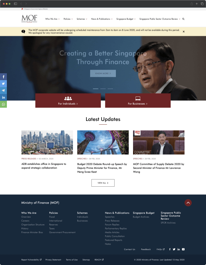
The Ministry of Finance is a ministry of the government of Singapore responsible for managing Singapore's fiscal policies and the structure of its economy.
The goal of this particular project was to identify any usability issues and improve upon them and the website's overall functionality, user-friendliness, and overall aesthetics.
Lead UX/UI Designer
User Research, Wireframing, Visual design, Prototyping & Testing
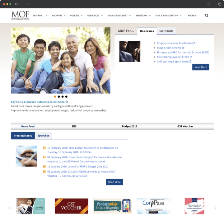
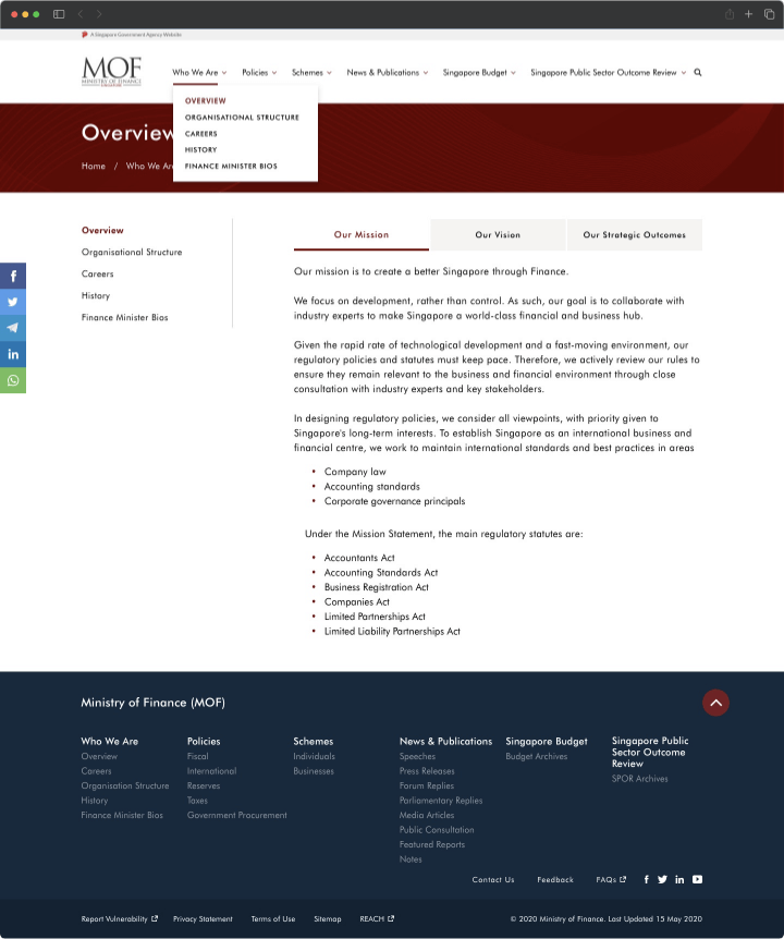
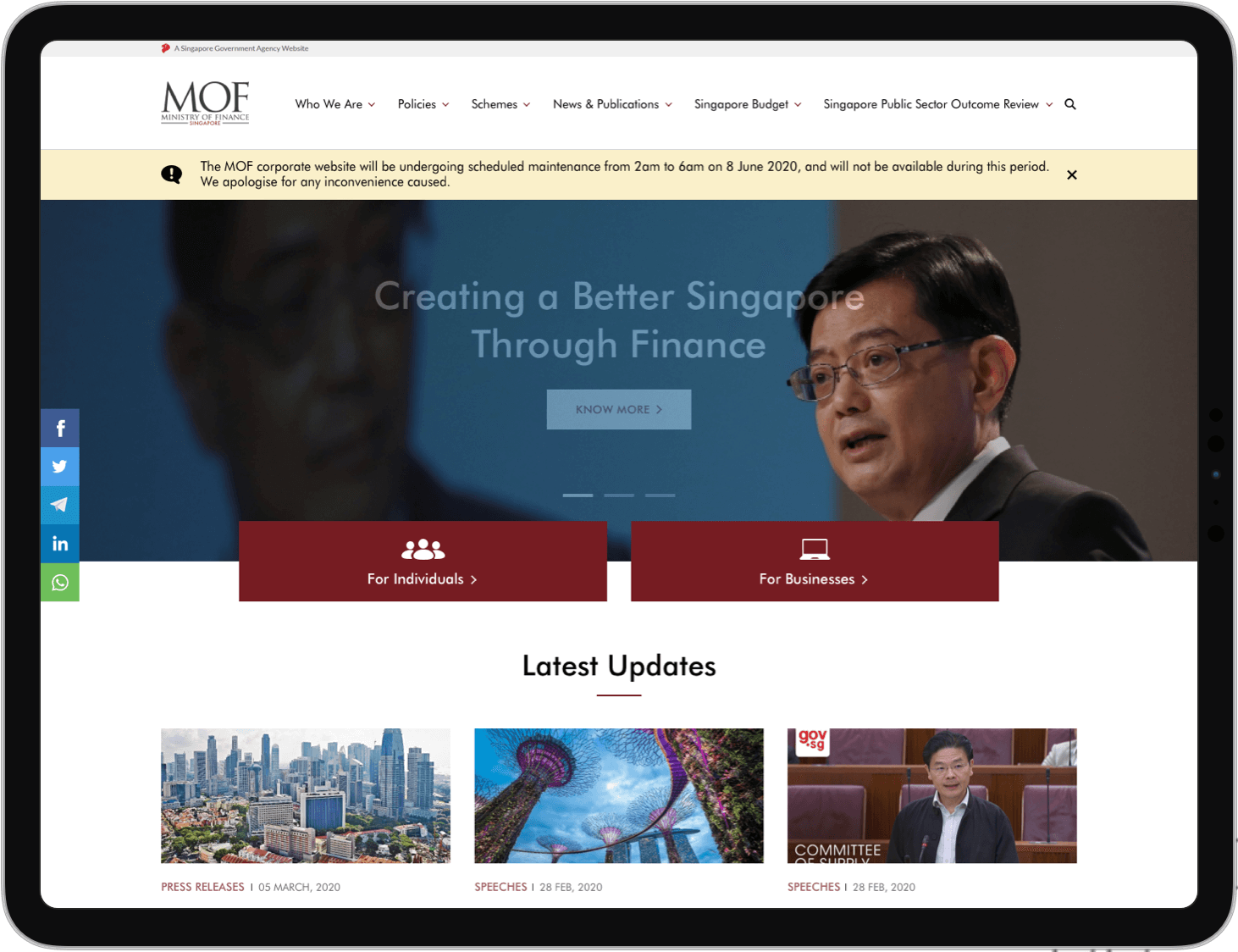
The MOF website is outdated and no longer reflect current design trends and best practices. It needs several improvements to enhance its usability and design.
By adhering to the Human-Centered Design(HCD) process, we explored the preferences of web users in terms of how they might want to use the MOF website. Guided by user research, we generated and formulated numerous solutions through brainstorming and design. Subsequently, we created wireframes and produced a high-fidelity interactive prototype based on the insights we obtained.
Competitive analysis is an important part of the website redesign process because it helps to inform user research by providing context on how other websites in your industry or niche are approaching the same design problems.
For this, we analyzed 3 other websites in this industry: US Department of Treasury, Australian Department of Finance and Hongkong Monetary Authority.
We analyzed them based on Page Structure, Usability, Navigation, Content and Design.
From the analysis, we learnt that:
1) The 3 websites have had better logical hierachy, this made it easier for users to understand content and navigate through the pages.
2) The MOF site lacked clarity in some pages compared to the competition, which might make it difficult for users to figure out what a page or feature is for.
3) Majority of the competing sites had better readability and visual appeal overall.
In order to gain better insights into users' needs, we conducted online user surveys and interviewed 8 website users to collect qualitative information about their experiences and to gauge whether the users had a need that was not met by the current site.
1) Users had difficulty navigating the website and locating information they need.
I am somewhat overwhelmed when I first visit the website, it felt like information overload and I had to really look hard where to find the info that I need.
2) Users found the layout was not intuitive and quite confusing to use.
The site’s layout did not look very consistent and the fact that it had 2 separate navigation bar, made it a little more confusing than it needed to be.
We decided to use Cardsorting for this project as our initial user research showed that users found the site to be disorganised and lacked logical hierachy.
Going with a Hybrid card sorting, as there were certain categories that had to remain the same, we conducted a cardsorting exercise with our users. This allowed us to gain insight into how our users think and categorize information and aided us in creating a proper information architecture.
The results of the exercise is then used to create the website's information architecture that is based on the user's mental model, making it easier for users to find the content they are looking for.
Based on the above problems identified, we worked towards addressing those pains by mocking up some basic wireframes to gather feedback from the users and stakeholders.
After the wireframes were validated by the users and stakeholders, it was time to apply the visual design.
MOF had a basic style guide that we had to follow in terms of colour palette and typography. Aside from that, we tried to improve the other visual elements to create a cohesive look and feel for the website.
We collaborated closely with the development team to actualize the designs. During the project's initial stages, we identified two main success metrics: enhanced engagement and increased satisfaction. Thankfully, our users reported an even more engaging and satisfying experience.
Throughout the 4-5 months, me and my team worked diligently to redesign the website with the goal of improving the user experience. We began with an in-depth analysis of the existing site's shortcomings and identified key areas for improvement. We then created wireframes and prototypes to test the new design concepts with users and iterated until we achieved an optimal design.
During the development phase, we collaborated closely with the development team to ensure the design was implemented accurately, and we conducted thorough testing to guarantee that the site was user-friendly and functional.
Post-launch, we monitored user feedback and analyzed site metrics to evaluate the effectiveness of the redesign. We are proud to report that the new site has seen increased user engagement and improved customer satisfaction. We are confident that the redesign will continue to deliver a positive impact on the user experience and drive business success.